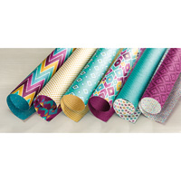
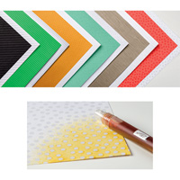
Do you even check the back side of a package of Stampin’ Up!’s Designer Series Paper? If you do, you’ll find a list of the major SU! colors used in the paper. These are colors you can use when creating a card or project.

At our downline meeting a few weeks ago, Elaine designed these three cards based on the colors used in the Designer Series Paper paper pieces:
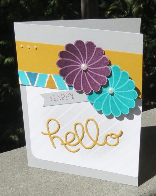 Main colors on this card: Delightful Dijon, Rich Razzleberry and Bermuda Bay card stocks and Bermuda Bay and Blackberry Bliss Classic Inks.
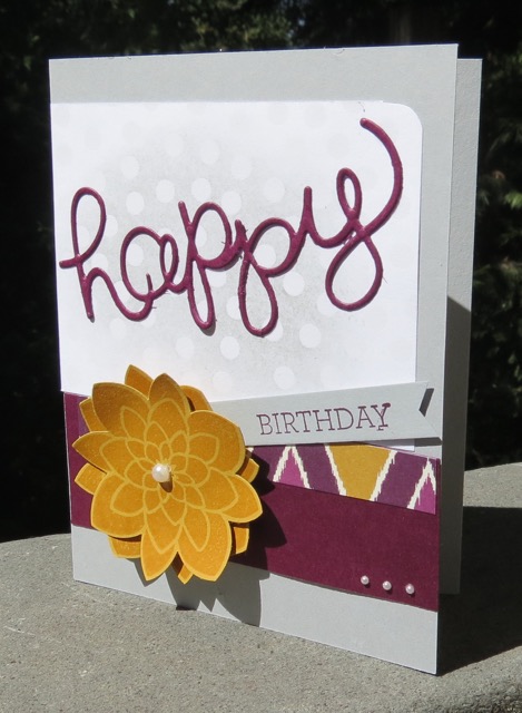 Main colors on this card: Delightful Dijon and Rich Razzleberry card stocks and Delightful Dijon and Blackberry Bliss Classic Inks.
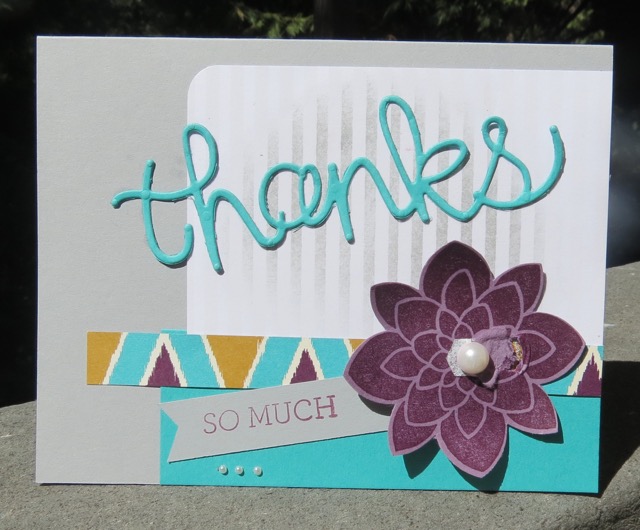 Main colors on this card: Bermuda Bay and Rich Razzleberry card stocks and Blackberry Bliss Classic Ink. (I messed up the flower by trying an bad experiment.)
Yesterday, at the Mi Wuk Library, we made a slight variation on Elaine’s theme and recreated this card.
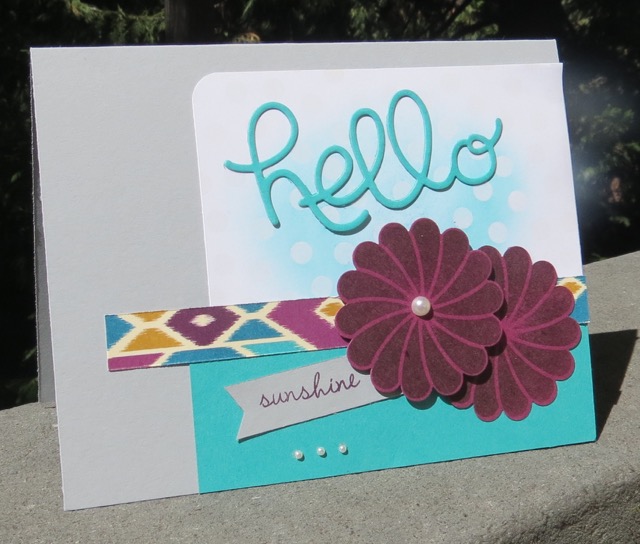 Main colors on this card: Rich Razzleberry and Bermuda Bay card stocks and Bermuda Bay and Blackberry Bliss Classic Inks.
For the first time, I used the soon to be released (September 1st, Holiday Catalog) Precision Base Plate. It. Is. Awesome. when cutting out the fine, intricate Framelits and Thinlits, such as the Hello You Thinlits.
TIP: Use the Precision Plate with the Multipurpose Platform. I found it worked best when I made this “sandwich” (from top to bottom):
- standard cutting pad
- die
- waxed paper
- single sheet of card stock
- Precision Base plate (label d-o-w-n—ask me how I know! – See photo below)
- multipurpose platform

Product List
Don’t forget to check out the back of your Designer Series Paper packages for that informative label when getting ready to create something wonderful. The coordinating color information will make your life so much easier!
