MONOGRAM LETTERS ‘J’, ‘K’ and ‘K’

No, that’s not a typo.  I just have two different people whose names begin with ‘K’.

I had so much fun decorating these monogram letters.  I asked each recipient what their current favorite Stampin’ Up! colors were and then used those colors on their letter.

J is for Janet
My sister and convention roommate Janet’s letter.  Her color choices were Lost Lagoon and Mossy Meadow.


K is for Katie
My roommate Katie’s letter. I met Katie, from upstate New York, via Sudsol, that great demonstrator only, business only email list. She was looking for a roommate 5 years ago and I offered for her to join us. We’ve been meeting and rooming annually ever since. You’ll meet our fourth roommate tomorrow. Katie’s color choice: Pumpkin Pie


K is for Kelly
Kelly is my third level downline and I look forward to seeing her at Convention.  Her color choices were the blue/greens:  Bermuda Bay, Coastal Cabana, Pool Party and Soft Sky.


Isn’t is fun to see how much a piece of Designer Series Paper can change a plain old monogram letter (purchased at M******) ?  And the difference between Kelly’s and Katie’s is fun too.

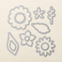
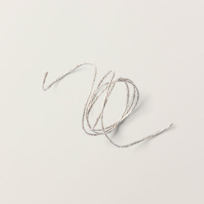
I used the photopolymer Flower Patch stamp set for all images and ‘cut them out’ with the Flower Fair Framelits as well as Linen Thread for a little accent.  Oooops, almost for the VersaMark stamp pad, Crushed Curry Embossing Powder and the Embossing Heat Tool.

While I’m at it, I also painted a layer of Modge Podge over the trimmed, sanded and filed to fit Back to Black Designer Series Paper before adding the flowers with either hot glue or Dimensionals.
 

I’ll have a few more letters tomorrow along with some fun ideas from my convention experience.  Thanks for stopping by.  See you soon.

Leave a Comment

Your email address will not be published. Required fields are marked *

ENTER YOUR EMAIL TO SUBSCRIBE
to receive updates and subscriber-only offers!

Scroll to Top